Your CFD shows the gap. More work entering the system than leaving it. The cumulative flow lines are spreading apart and you can see the problem building in real time.
But “arrivals exceed throughput” doesn’t tell you what to do about it. It tells you there’s a problem. It doesn’t tell you which kind of work is driving it.
Is it bugs flooding in from production? Is it a spike in feature requests that leadership approved without checking capacity? Is it one category of work that tripled while everything else stayed flat? The aggregate number hides the answer inside it.
This is the gap we just closed in Nave.
Demand vs Capacity Analysis
The Arrival & Throughput Rates widget on the CFD now supports a stacked bar breakdown. Instead of a single line showing total arrivals against total throughput, you see two stacked bars for each period — one for what arrived, one for what was delivered — broken down by the dimension that matters to you.
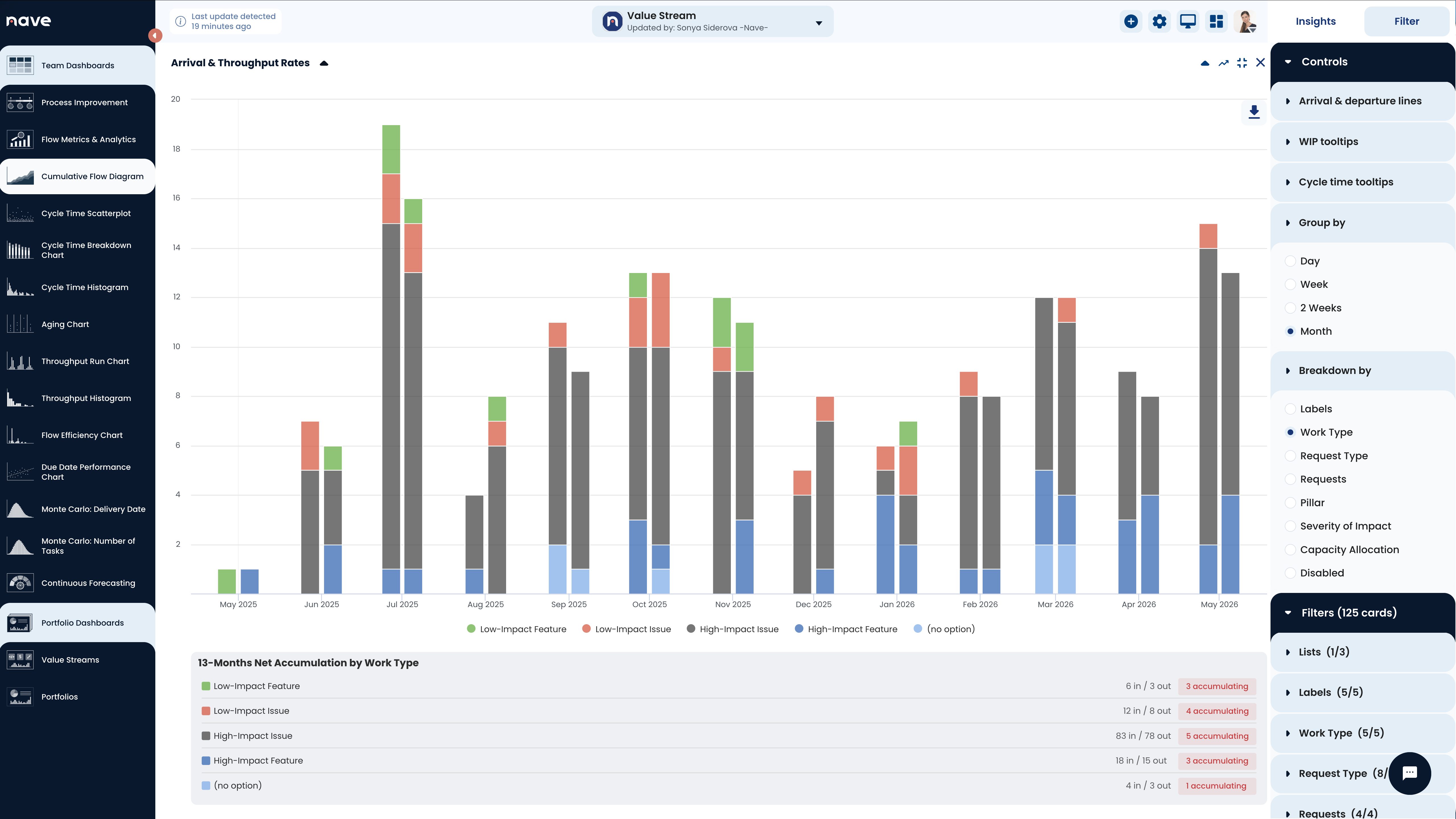
Work Type. Labels. Request Type. Requests. Pillar. Severity of Impact. Capacity Allocation. Pick the dimension that matches the question you’re asking.
The bars sit side by side for each period. Each segment is a category of work, color-coded and filterable. You can see instantly which types of work are accumulating and which ones your team is keeping up with.
Group by day, week, two weeks, or month. The view adjusts to the cadence of your planning conversations.
Below the chart, the net accumulation summary shows you the totals: how many items arrived, how many went out, and whether each category is accumulating or clearing. In the example above, every single work type is accumulating — and High-Impact Issues dominate at 83 in / 78 out. The system is taking on more than it’s delivering, and one category is consuming most of the capacity.
What This Looks Like in Practice
A team lead opens the CFD and switches to the demand vs capacity view. She groups by two-week periods and breaks down by work type.
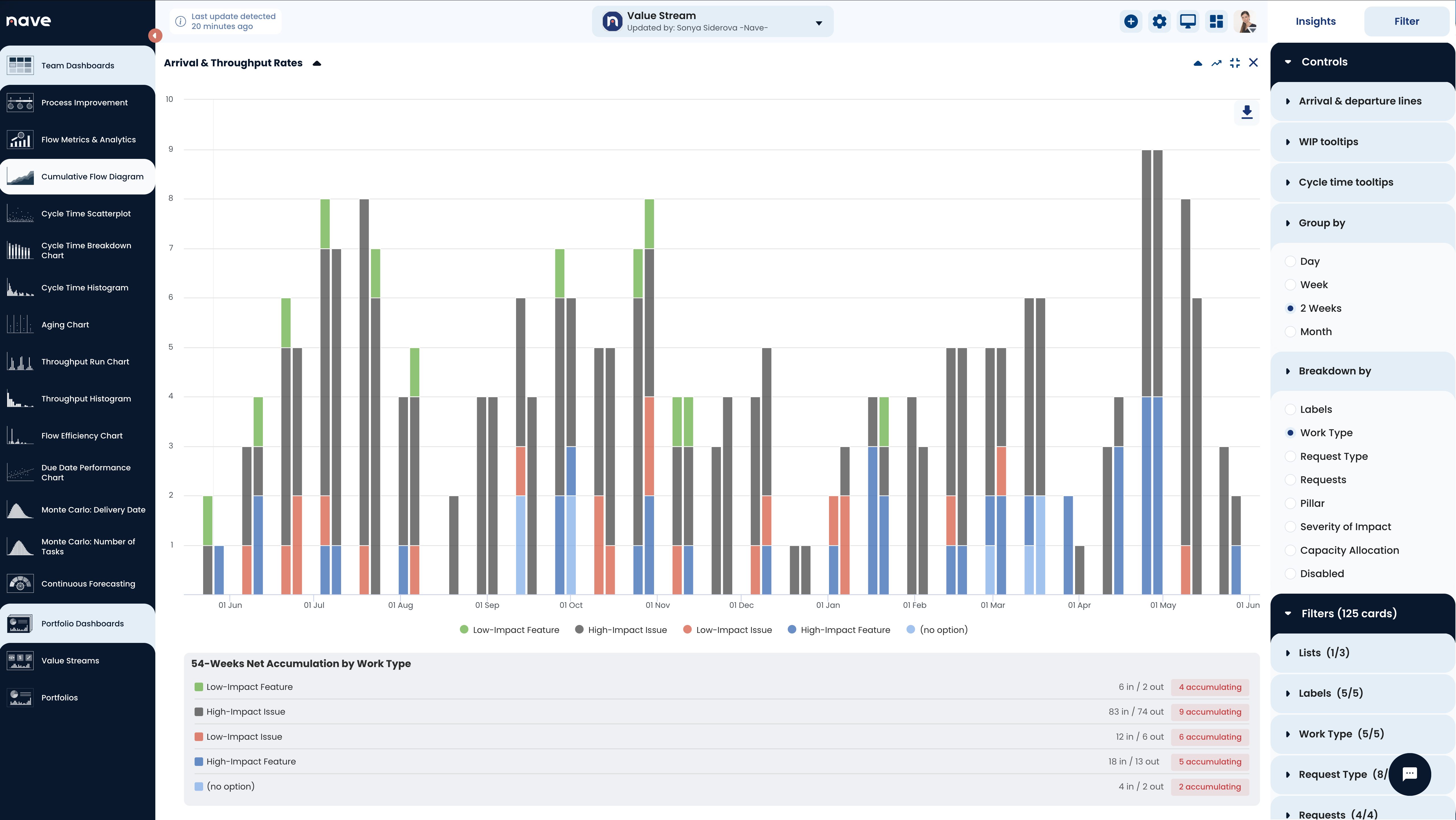
The pattern jumps out. High-Impact Issues dominate everything — 83 in, 74 out over 54 weeks. That’s two thirds of all demand. The team is spending almost all of its capacity reactively solving issues. Features barely register: 18 High-Impact Features arrived in the same period, 13 delivered. The ratio tells the story — for every feature the team ships, they’re handling nearly five issues.
This isn’t a team that’s falling behind. It’s a team trapped in reactive mode. The capacity exists. It’s being consumed by issue resolution, leaving almost nothing for the work that moves the product forward.
Without the breakdown, the team lead walks into the planning meeting saying “we’re keeping up.” With it, she walks in saying “two thirds of our demand is issues. If we don’t address the source of these issues, we’ll never get back to building features. Here’s where we need to make a decision.”
The Tooltip Tells the Full Story
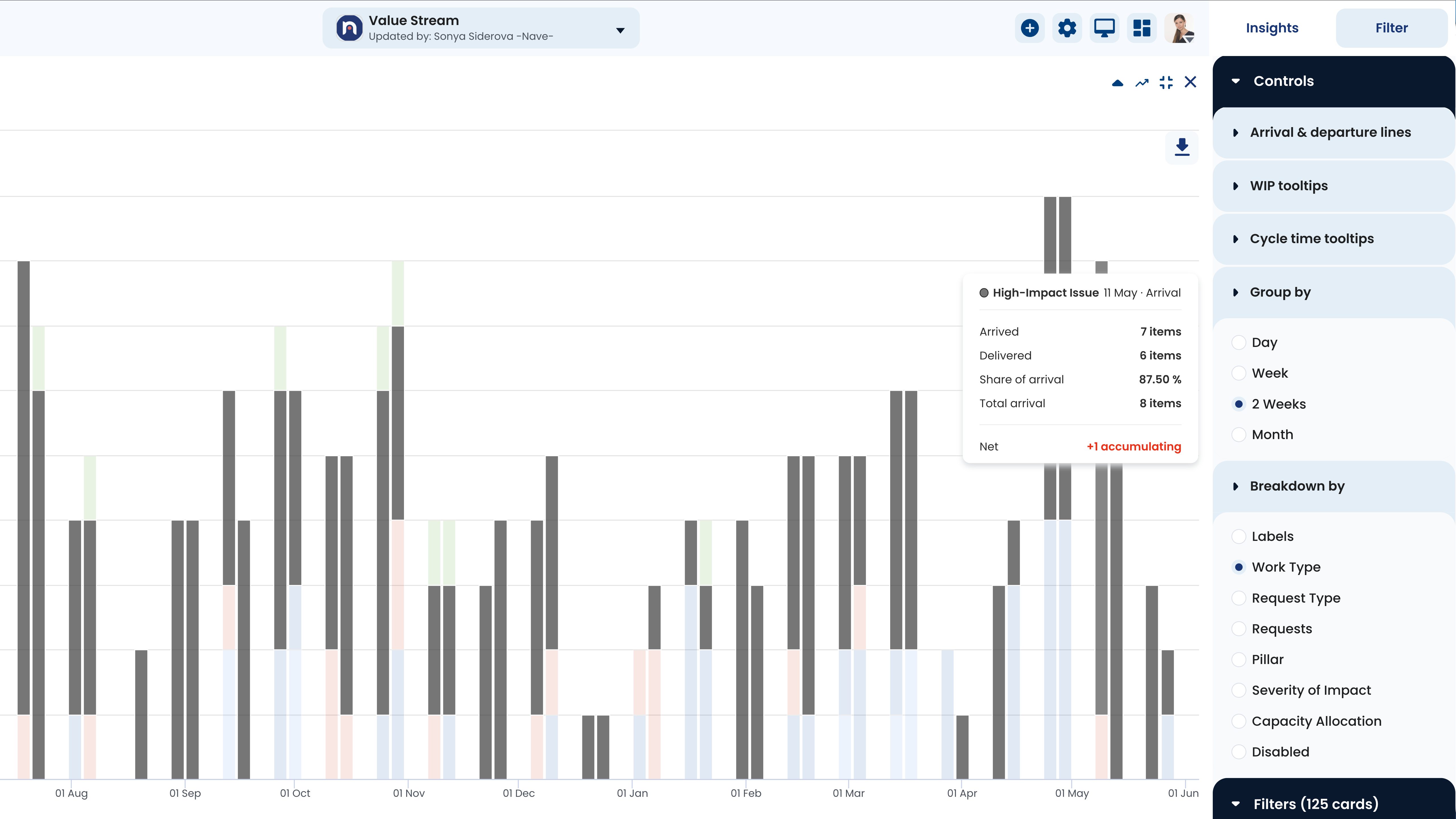
Hover over any segment and the tooltip shows you everything. In this example: High-Impact Issues in the 11 May period — 7 arrived, 6 delivered, 87.5% of all arrivals, net +1 accumulating. One glance tells you this category is the dominant source of demand and it’s slightly outpacing throughput.
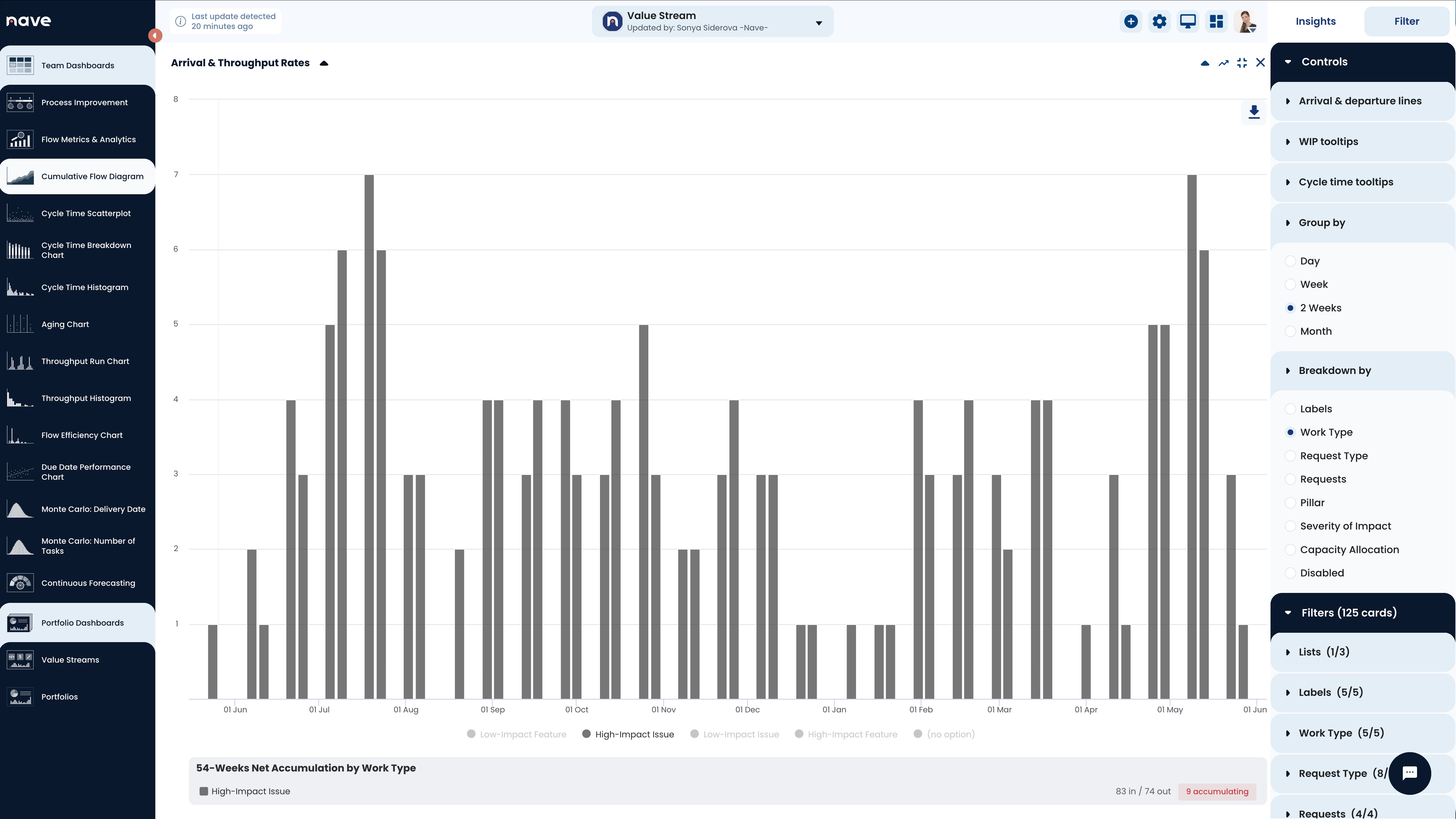
The share percentages recalculate based on what’s visible. Click a legend item to hide a category, and the percentages adjust to show you the composition of what remains. This matters when you want to isolate just two or three work types and compare their demand patterns without the noise of everything else.
The Conversation This Enables
Every team has a capacity constraint somewhere. The question leadership needs to answer isn’t “are we overloaded?” — they already know that. The question is “what’s overloading us, and what are we going to do about it?”
This chart puts the answer on the screen. It shows exactly which categories of work are driving the imbalance, how the pattern has changed over time, and where the gap between demand and capacity is growing.
That’s the conversation that leads to a decision: throttle intake on one category, add capacity to another, or escalate the trade-off to someone who can make the call.
The data is already there. Now you can see it.
Try it on your own team’s data at getnave.com.