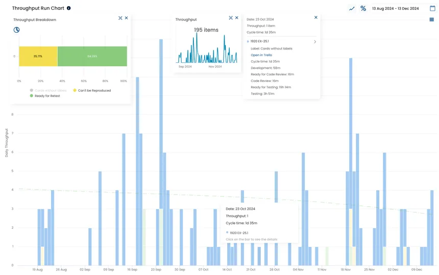
Throughput Run Chart
Open the Throughput Run Chart to track progress over time and spot trends that can inform your strategy.
What it answers
How much are we delivering?
Understand the distribution of your historical throughput and see how often different delivery rates occurred.
Example

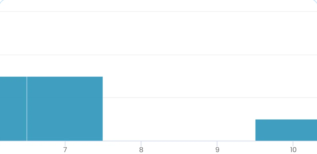
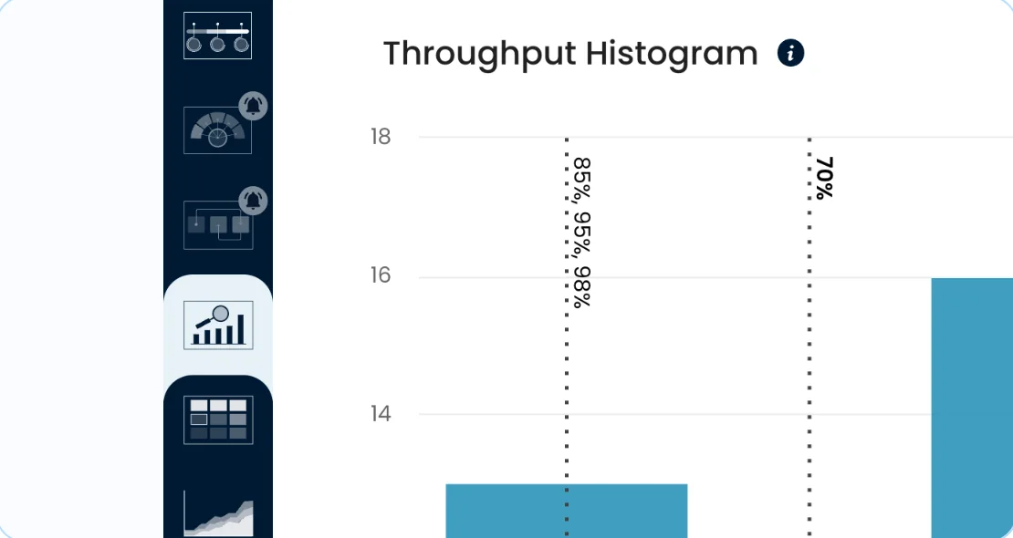
A bar shows the frequency of one throughput value. Together, the bars show the shape, spread and overall distribution of your completed work.
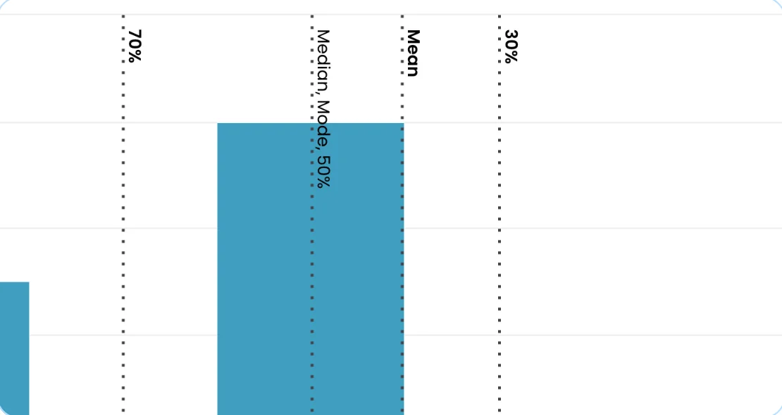
The Mean line represents the average number of tasks completed in a day, week or month. Outliers can skew the mean up or down.
A percentile line represents past performance data. It connects a daily, weekly or monthly task commitment with the probability of meeting it.
Throughput measures how quickly you finish work within a specific time frame. The Throughput Histogram shows the frequency distribution of your completed work, including its median, spread and overall shape.
Track throughput with the Throughput Histogram to assess your team capacity to deliver results.
Assess your team performance by reviewing the average number of tasks completed in a day, week or month.
Average throughput represents your capability to deliver. Outliers can skew the mean up or down, so use the median to assess performance when your dataset contains outliers.
You can exclude zero values caused by non-work days, such as weekends, public holidays and vacations.
Review average throughput both with and without weekend values. Include weekend lows for an accurate value over longer periods, or leave them out for a more accurate average for a typical business day.
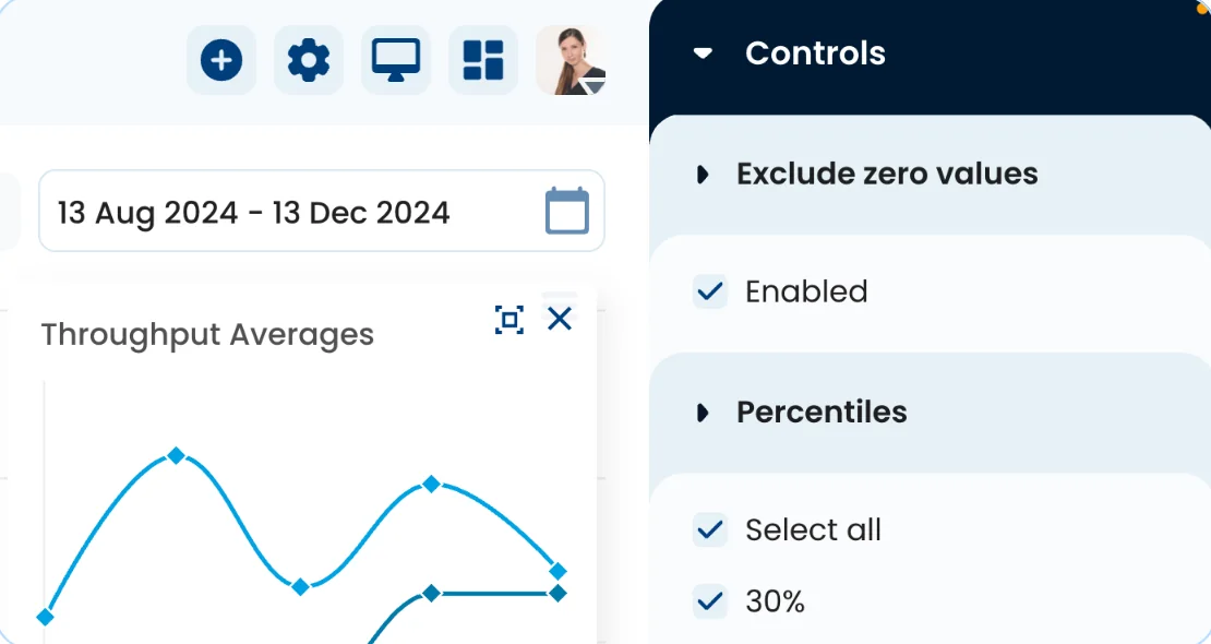
Percentile lines represent your past performance data. Use them to define how many tasks you can commit to completing daily, weekly or monthly, along with the probability of meeting that commitment.
Base short-term commitments on your throughput performance metrics, and consider the certainty level of each forecast.
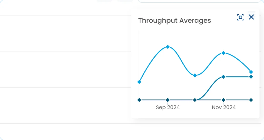
The ‘Throughput Averages’ widget shows the mean, median and mode of your throughput over time. Ideally, the lines should increase smoothly and remain close together.
Choose an average and monitor its line profile. A decreasing gradient means your team is delivering less value. Use WIP limits to prevent bottlenecks and help work flow smoothly.
You can export the filtered data shown in this chart as a CSV.
Much higher or lower values can skew the distribution left or right. In these cases, the mode, median and mean are different.
A bimodal distribution has two peaks and indicates two overlapping groups in the dataset.
Zero values may come from non-work days such as weekends, public holidays and vacations, making the team appear less productive.
Open the Throughput Run Chart to track progress over time and spot trends that can inform your strategy.
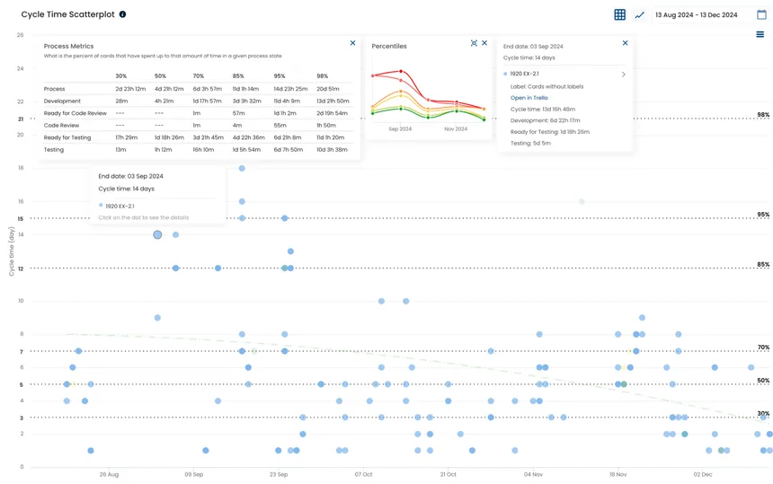
Open the Cycle Time Scatterplot when making a reliable delivery commitment for a single work item.
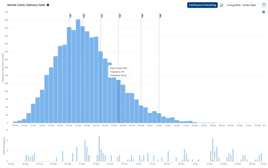
Open Monte Carlo: Delivery Date to make reliable probabilistic forecasts for your project.
Connect your existing delivery data and start exploring your flow.